Seaborn is a wonderful python package for creating statistical plots like those found in R. Although the documentation and API does not expose much, the modules are built on top of matplotlib, a versatile plotting library. Matplotlib has an incredible amount of customization, if you’re willing to dig far enough. My goal with this post is simply to document the customizations I have encountered. The changes are made on the ‘iris’ demo.
Empty Axes
Using seaborn with the default ubuntu matplotlib package (python-matplotlib) will result in plots with empty axes:
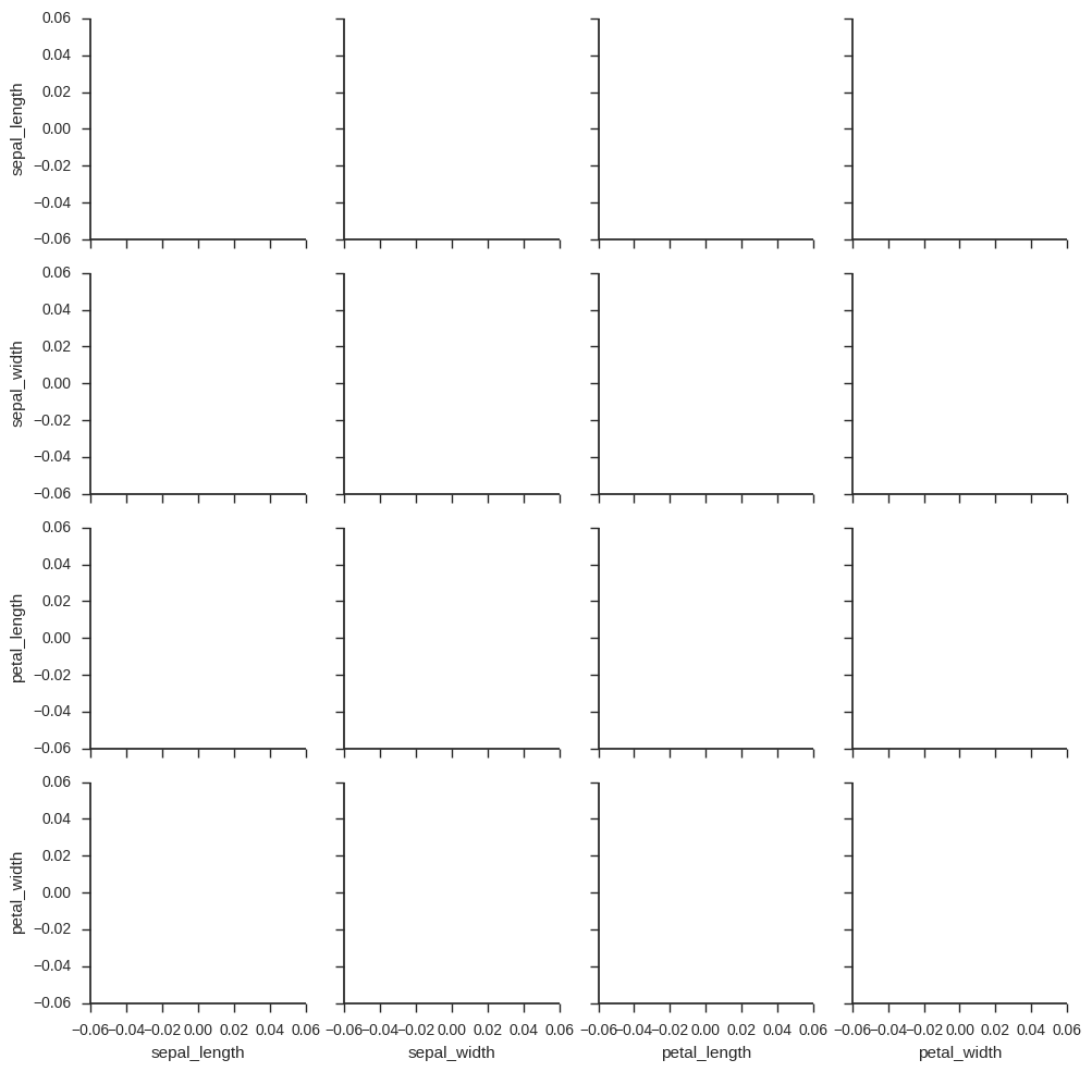
To resolve this, matplotlib must be updated past version 1.3:
$ sudo apt-get install libfreetype6-dev
$ sudo pip install --upgrade matplotlib
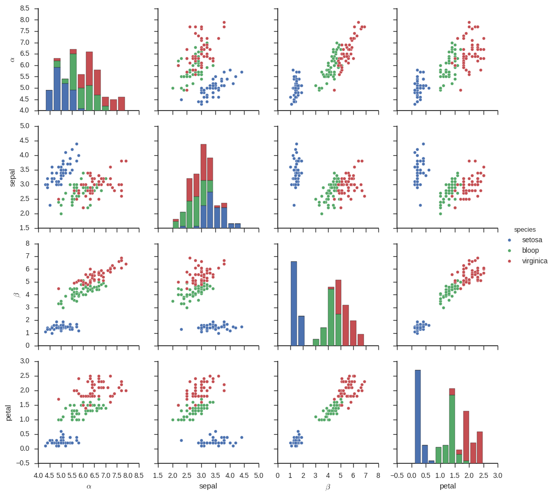
Custom Data Labels
Seaborn will take the keys from the dataframe as the x and y axes labels, and assign labels only if the subplots are around the left and bottom sides of the grid. Replacing them means dipping down to the axes level:
import seaborn as sns; sns.set(style="ticks", color_codes=True)
iris = sns.load_dataset("iris")
g = sns.pairplot(iris, hue='species')
replacements = {'sepal_length': r'$\alpha$', 'sepal_width': 'sepal',
                'petal_length': r'$\beta$', 'petal_width': 'petal',
                'versicolor': 'bloop'}

for i in range(4):
    for j in range(4):
        xlabel = g.axes[i][j].get_xlabel()
        ylabel = g.axes[i][j].get_ylabel()
        if xlabel in replacements.keys():
            g.axes[i][j].set_xlabel(replacements[xlabel])
        if ylabel in replacements.keys():
            g.axes[i][j].set_ylabel(replacements[ylabel])
Similarly, the hue categories are taken from the values in the dataframe. Most of the template graphs (such as pairplot), add a legend to the top level figure on being called, and this makes it difficult to edit.
In addition, the matplotlib Figure object does not provide a get_legend() method. Instead, it is possible to access via get_children(). The legend is the last artist added, so it will be at index -1:
for i in range(len(g.fig.get_children()[-1].texts)):
    label = g.fig.get_children()[-1].texts[i].get_text()
    if label in replacements.keys():
        g.fig.get_children()[-1].texts[i].set_text(replacements[label])
This is the resulting graph:
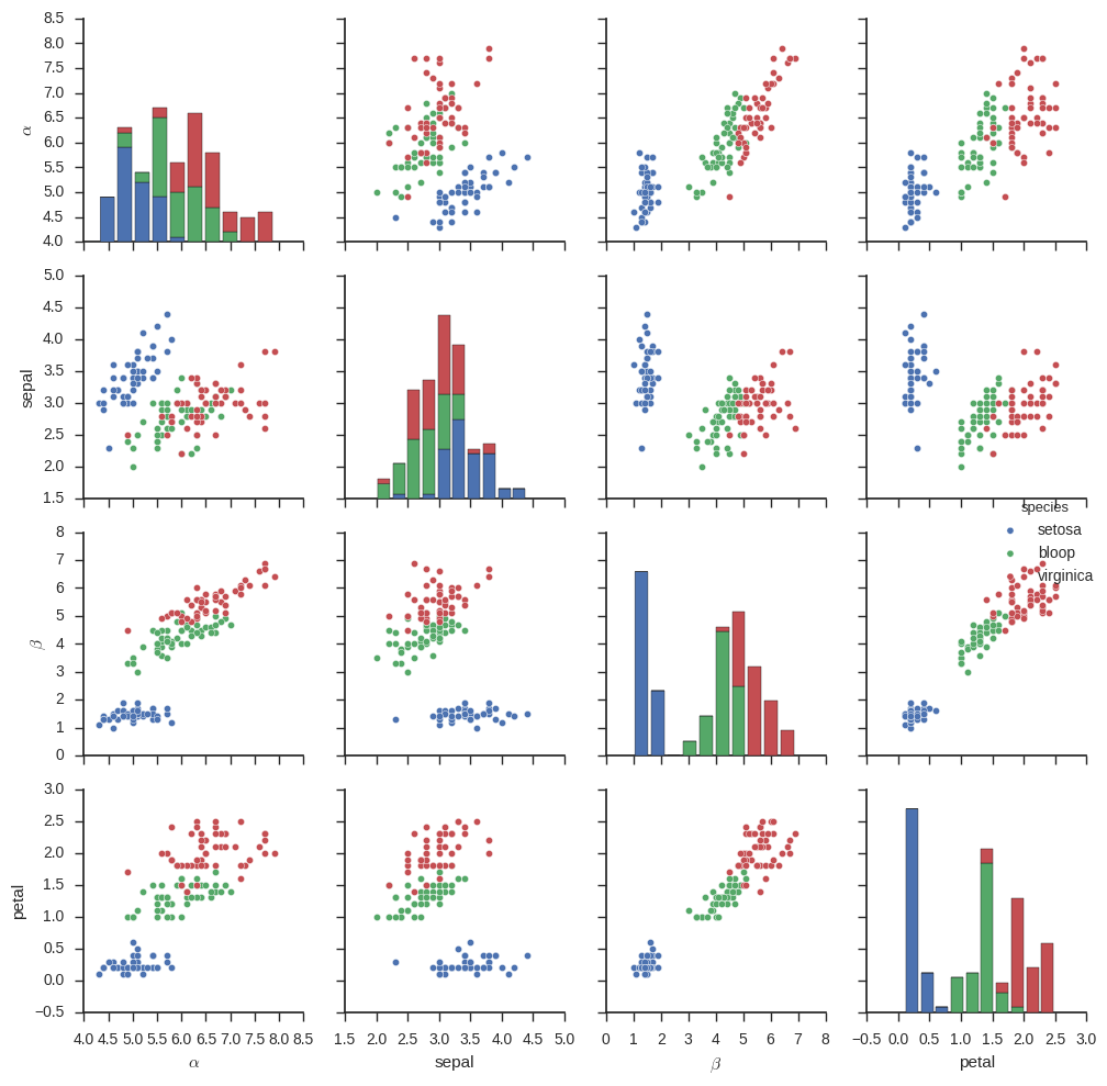
Moving the Legend
There are plenty of ways to place a legend in a figure when it is created, but moving the legend once it is already in the figure is a different story. The one method I’ve found is to move the legend’s anchor using set_bbox_to_anchor. These numbers seem to be expressed as a function of the size of the total figure, and are expressed as (left, bottom, width, height) . Since the figure expands to fill the required space of all the artists, width and height can be zero. So, the following code will put the legend in the middle in the y direction but over right edge of the figure:
g.fig.get_children()[-1].set_bbox_to_anchor((1.1, 0.5, 0, 0))